Cravio
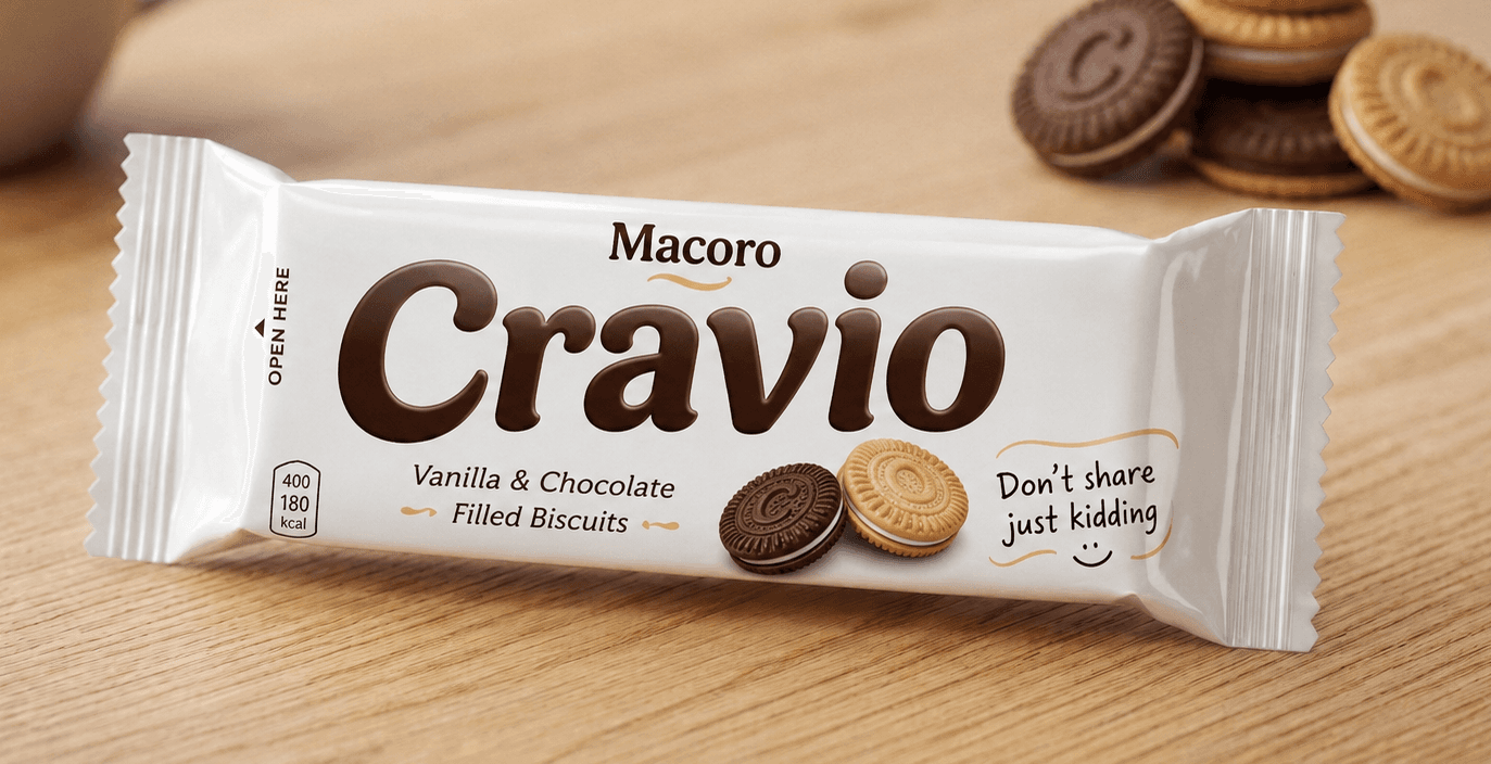
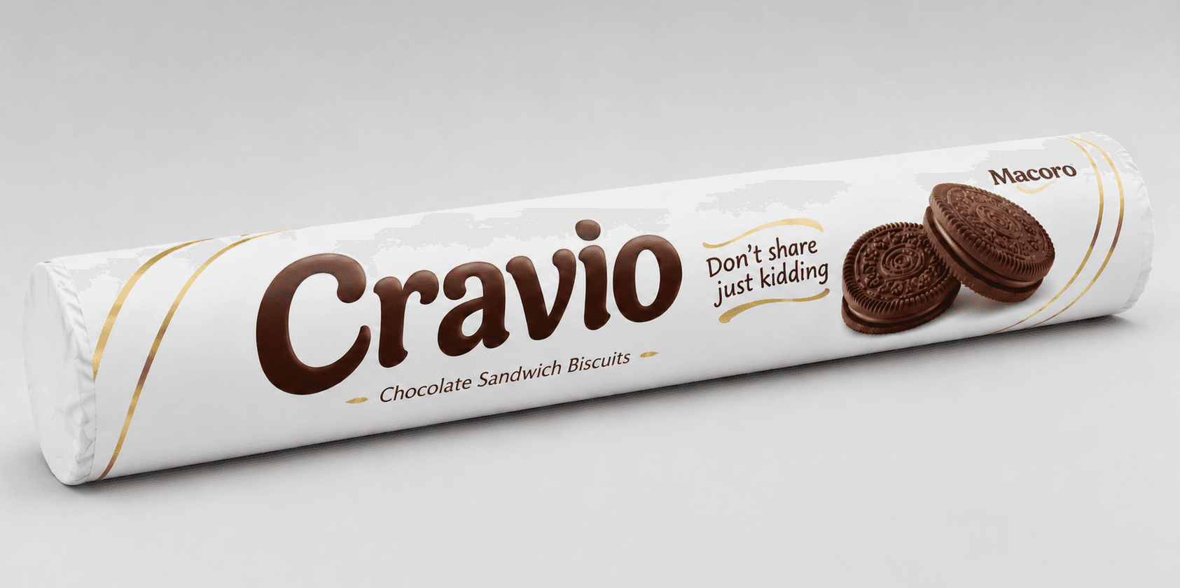
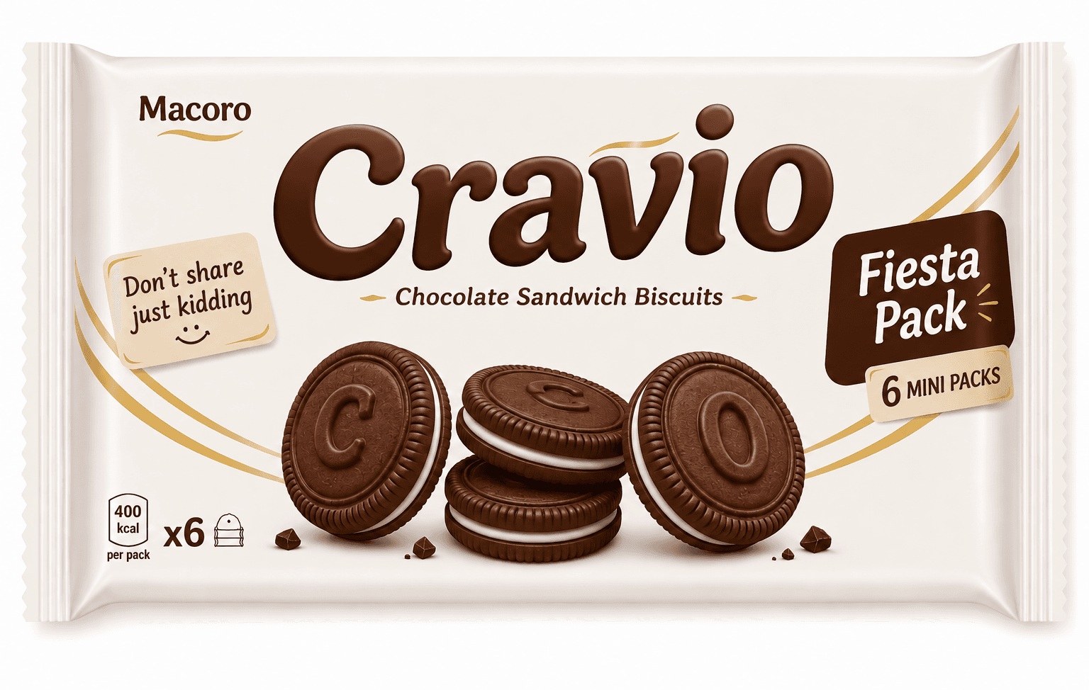
A complete biscuit brand identity and three-tier packaging system; naming, typography, and front-panel design. Conceived and executed solo in a single 12-hour design sprint.
Build a full brand from zero in 12 hours: invent a brand name, tagline, and visual identity for a biscuit product, then design front-panel packaging that speaks to three distinct audiences — without reusing a single design decision across formats.
Worked through the full brand pipeline in sequence: audience definition, naming and tagline writing, typography selection, then packaging layout and colour strategy - designing three separate front panels (Mini, Classic, Fiesta) each with its own logic: playful and bold for kids, minimal and premium for on-the-go adults, festive and gift-worthy for family sharing.
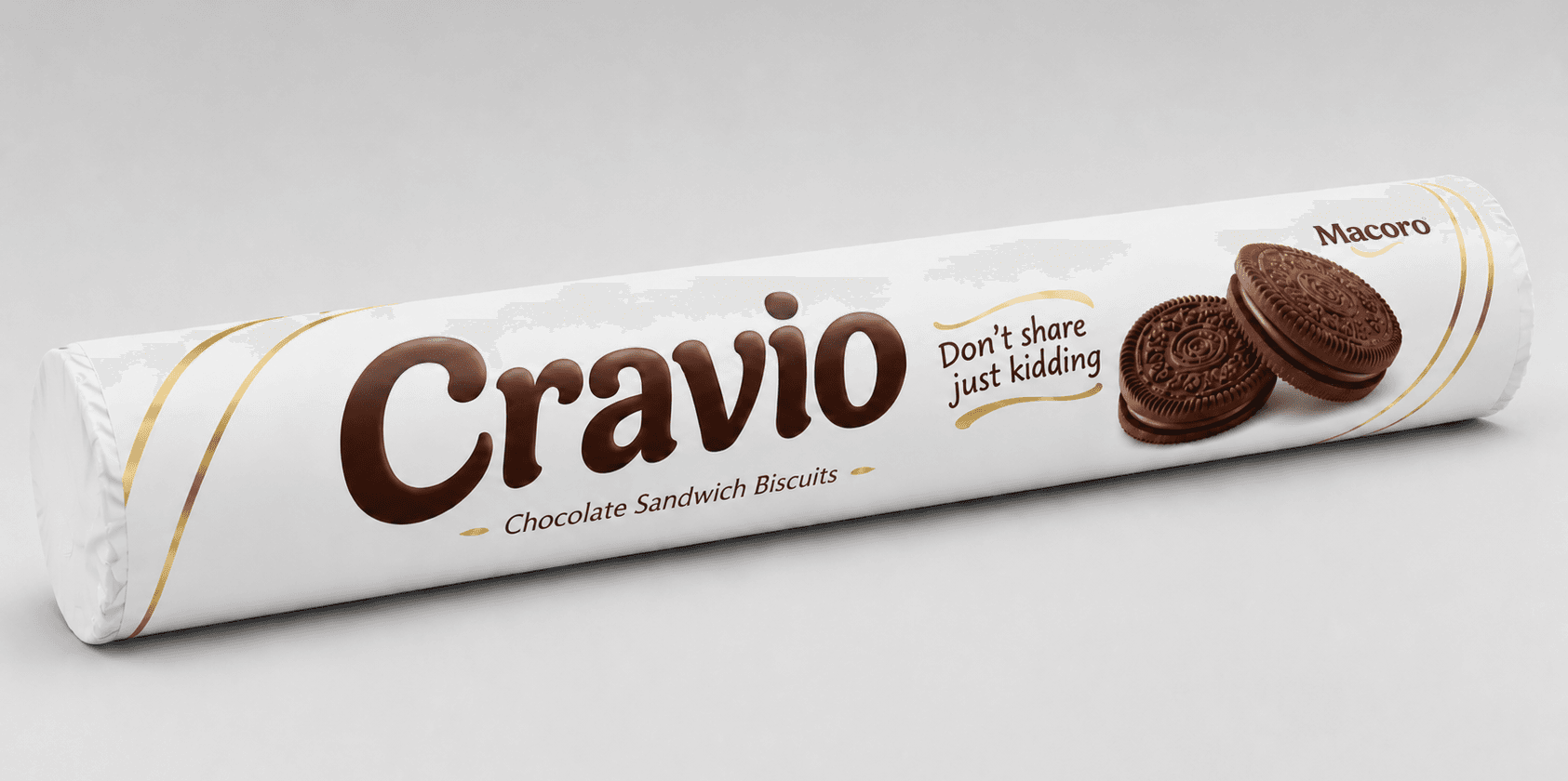
Delivered a cohesive, professional-grade brand system — Macoro/Cravio — spanning three packaging formats unified by a consistent gold-foil-and-white visual language, each precisely tuned to its target buyer, all within the sprint's 12-hour window.
- Adobe Illustrator
- Adobe Photoshop
- Typography
- Packaging Design
- Brand Identity